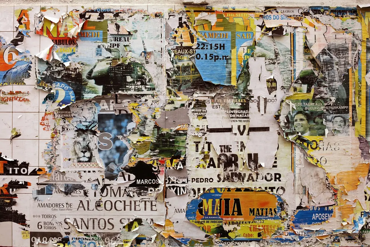
Local Angle: What a City’s Street Posters Reveal About Its Visual Culture
Walk two blocks in almost any city with foot traffic and you will pass a wall that has been arguing with itself for years. A concert bill from last spring, sun-bleached to lavender, sits under a missing-cat notice, which sits under a flyer for a language school, which sits under a strip of wheatpaste holding nothing at all. Nobody designed this. It accumulated. And that is exactly why it is worth looking at.
Shopfronts are paid for and polished. Museums are edited by committees. But a photocopied sheet taped to a lamppost is a decision made by one person with a small budget and a deadline, and it survives or disappears on the strength of whether anyone cared. Read enough of them and a city starts to tell you things it does not say in its branding guidelines.
The Wall as a Palimpsest
Look first at depth. In cities that clean aggressively, posters live short lives: taped to glass, trimmed to the frame, gone by Thursday. In cities that clean rarely, layers build up like sediment, and you can date a neighbourhood’s interests by digging down. A yoga studio beneath a lost dog beneath a protest notice beneath a poster for a bar that no longer exists is not mess. It is stratigraphy.
The condition of the surface tells you what a city expects its messages to do. Where paper is allowed to weather, a poster is treated as a temporary fact of street life, like a parked car. Where it is stripped within days, the poster becomes an event — brief, urgent, almost performative. Neither is better. But the two cities produce completely different visual habits, and the people pasting in each have learned different rules.
Repetition Is the Message
Now count. Ten minutes on a busy corner will usually give you a working sample, and the proportions are more revealing than any single sheet. Nightclub nights, English classes, moving companies, church notices, tutoring, lost keys, gyms, cheap flights. The ratio sketches the local economy at street level: who has a small budget for outreach, and who assumes everyone already knows.
Language is where it gets interesting. A poster in three languages with the dominant one set largest is a small statement about who the street is for. So is a flyer where the local language has been reduced to a polite line at the bottom. Compare a hospital notice board with a student quarter’s lampposts and you will see two different theories of who reads what.
What is absent is evidence too. A neighbourhood with no posters at all is not a neighbourhood without culture — it is one where culture is advertised somewhere you cannot see from the pavement.
A Typography of Small Budgets
The typography is often dismissed as bad. It is better read as functional. Impact, Times New Roman, a Canva template with the placeholder still faintly visible, a WordArt gradient that survived from 2004 — these are the fonts of people who needed a headline by Friday. Photocopies degrade in a specific way: greys go muddy, halftones clot, and a photograph of a DJ becomes a smudge that reads perfectly well at three metres.
Watch for the seams. An A4 design tiled and taped into A2, with a visible join through the middle of a word, tells you the printer only handled A4 and the ambition was larger than the equipment. Watch for the marker correction over a printed phone number — proof that a design was reused rather than remade, which is its own kind of thrift.
Colour is rarely taste. It is legibility. Fluorescent pink on black reads from across a road; a soft pastel palette signals a venue that expects you to already be interested, and probably to already follow it online. Then there is the humble tear-off tab, a small technology that measures trust. If every tab is gone, the poster worked. If none are gone, either nobody walks there or nobody needed what it offered.
Placement Is the Argument
Where a poster goes is a claim about attention. The best placements sit at the exact height of a person waiting for a bus, on the side of a pole that faces oncoming foot traffic, or beside a crossing where people are already stopped and bored. Knee-level papering is quantity over care: someone covered a surface rather than choosing a spot.
- Height: eye level suggests intent; ankle level suggests volume.
- Orientation: check which way the pole faces and which direction pedestrians come from.
- Distance: a flyer three streets from its venue asks more of you than one outside the door.
- Technique: staples, tape, wheatpaste and cable ties each leave different marks and imply different budgets.
- Overlap: whoever pastes on top of whom is a small, local hierarchy of urgency.
Reading Your Own City: A Method
You do not need a research budget, just a repeated walk and a willingness to be boring about it.
- Choose a fifteen-minute stretch with mixed uses — a transit stop, a school, a bar, a corner shop.
- Photograph everything straight on and at eye level, including the boring sheets.
- Come back a week later and shoot the same surfaces again.
- Note what is new, what survived, and what has been covered over.
- Log four things: language, purpose, printing method, and how it was attached.
- Repeat in a second neighbourhood with a different income level, and compare.
- Ask explicitly what is missing, and where those messages might be going instead.
The Limits of the Evidence
It is one layer, not the whole picture, and it is a biased sample. Legal posting is a fraction of what you see, and the illegal kind tends to be removed quickly, which distorts the record toward whatever survives enforcement. Affluent areas often look visually quiet simply because their advertising is bought rather than pasted. And a great deal of what used to be a flyer now lives in group chats and stories, leaving the street thinner than it was a decade ago.
Be a considerate reader, too. Photograph the surface, not the people standing near it. Do not peel anything off a wall to read the layer beneath, and do not assume a poster on private property is fair game to rearrange. If you are posting rather than observing, check what your own city permits — rules vary widely and fines are real.
Practical: A Field Guide for the Next Walk
Carry a phone and shoot flat, filling the frame, so you can compare type sizes later. Keep a single notes file with dates rather than a scatter of images you will never sort. Look at the back of poles as well as the front; the unused side is a useful control. Go out after rain, when torn edges curl and exposed layers show themselves. Do one weekday and one Saturday, because the two cities barely resemble each other.
And when you find a surface with real depth, photograph it properly now. The layer is thinning, the paste is drying, and the next cleaning crew is already scheduled. A city’s visual habits are written on its walls in a handwriting nobody chose — which is precisely why it is the most honest thing on the street.
Photo: StockSnap / Pixabay


You Might Also Like
A practical look at when the phone in your pocket beats the camera in your bag for daily visual storytelling — and when it quietly falls short.
From municipal light displays to shop windows and ad campaigns, seasonal celebrations redraw the visual codes of public space. A guide to reading the change, and to using it well.